Case Study - Find A Coach |
Case Study - Find A Coach |
My Involvement
UX Designer | UX Researcher | UX Writer
Responsibilities include, user research, wireframing, prototyping and writing.
User Research | Personas | Problem Statements | User Journey Maps
Take a minute to write an introduction that is short, sweet, and to the point.
The Mission
FindACoach is a user-centered mobile app designed to bridge the gap between professionals seeking career clarity and the expert coaches who can guide them. The platform allows users to seamlessly browse coach profiles, view specialties, read reviews, and book sessions, making career development accessible, personalized, and action-oriented for every stage of the user’s journey.
1
Users struggle to verify a coach’s credibility due to unclear qualifications, missing reviews, or vague bios.
The Duration
The project was completed over a 2-month period, including research, wireframing, prototyping, and usability testing.
User Research - Summary
User research for FindACoach involved interviews and surveys with 15 professionals across industries and locations, revealing key challenges in finding credible, aligned career coaches. Participants expressed frustration with scattered platforms, unclear coaching specialties, and lack of trust signals. They prioritized verified experience, transparent pricing, flexible booking, and personalized guidance. Users also emphasized the need for clear bios, reviews, and value upfront. These insights informed design decisions such as coach filtering, simplified booking, and features that build trust and make career support more accessible.
The Problem
Many professionals struggle to find credible, experienced career coaches who align with their unique goals, industry, or career stage. The search is often scattered across social media, forums, and referrals, leading to delays, confusion, and lack of trust. FindACoach solves this by centralizing vetted coaches in one trusted platform, enabling users to discover and connect with the right mentor faster and more confidently.
2
Finding the right coach across multiple platforms feels disjointed, time-consuming, and often leads to decision fatigue.
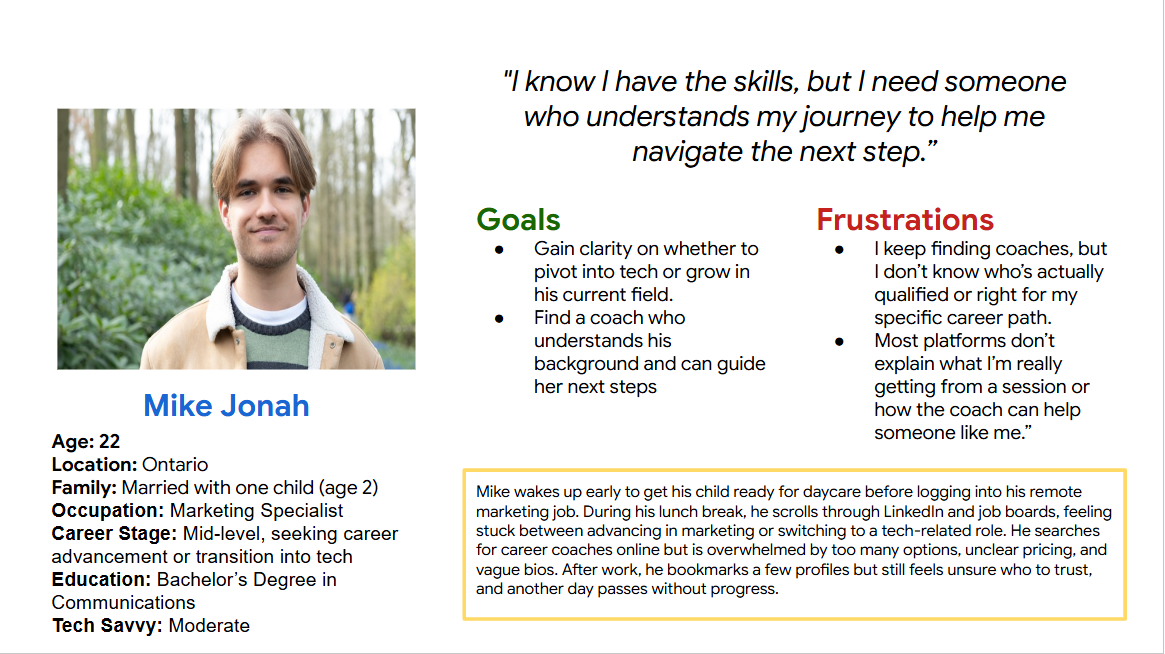
Problem Statement
Mid-career professionals like Mike struggle to find trustworthy, specialized career coaches due to scattered platforms, unclear coach credentials, and lack of transparency in pricing and session outcomes, resulting in frustration, indecision, and stalled career growth.
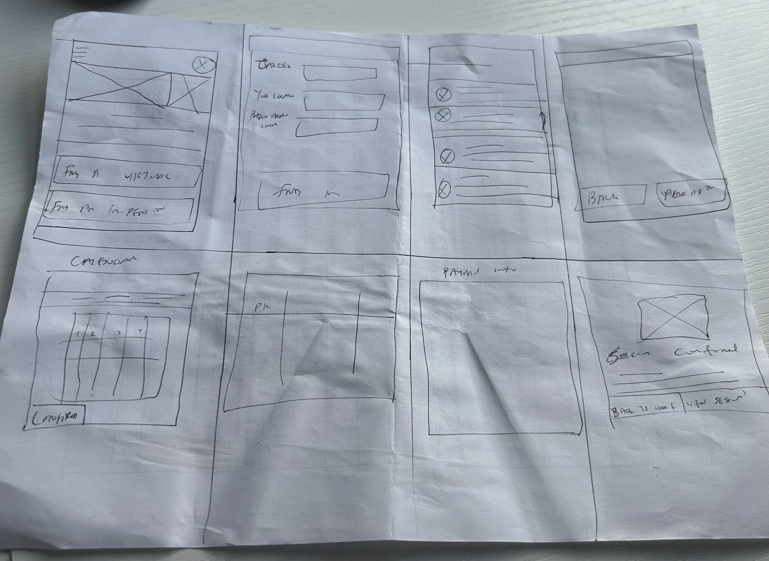
Paper Wireframe
The wireframe was designed with a clear user journey in mind, guiding users from initial intent to final confirmation in a seamless, intuitive flow. Starting with the homepage, users personalize their experience by choosing between virtual or in-person coaching. From there, preference inputs help refine coach recommendations. The design prioritizes clarity, offering detailed coach profiles, transparent pricing, and straightforward appointment booking. Each screen supports decision-making while reducing friction, ensuring users feel confident, informed, and in control at every step.
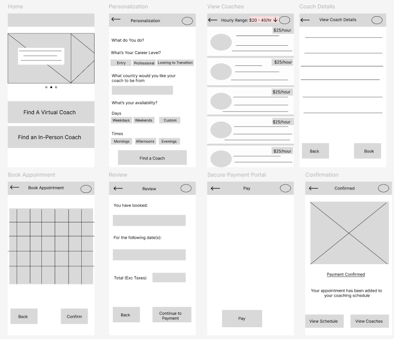
Digital Wireframe
The digital wireframe builds upon the foundational user journey outlined in the paper version, bringing structure, hierarchy, and visual clarity to each interaction. Designed with usability in mind, each screen is clean and intuitive, guiding users from selecting their preferred coaching mode to filtering options and reviewing coach profiles. Key elements like pricing, credentials, and availability are made easily scannable, while the booking and payment process remains streamlined. The goal is to create a smooth, personalized experience that reduces cognitive load and builds user trust.
Lo-Fi Prototype
The low-fidelity prototype translates the digital wireframe into an interactive format, allowing for early testing of user flow and functionality. It focuses on layout, navigation, and screen-to-screen transitions without the distraction of color or detailed visuals. This version helps validate core decisions—such as how users select coaching preferences, browse profiles, and complete bookings—while identifying usability issues before high-fidelity design begins. The prototype ensures the experience remains intuitive, goal-oriented, and aligned with user expectations from first tap to confirmation.
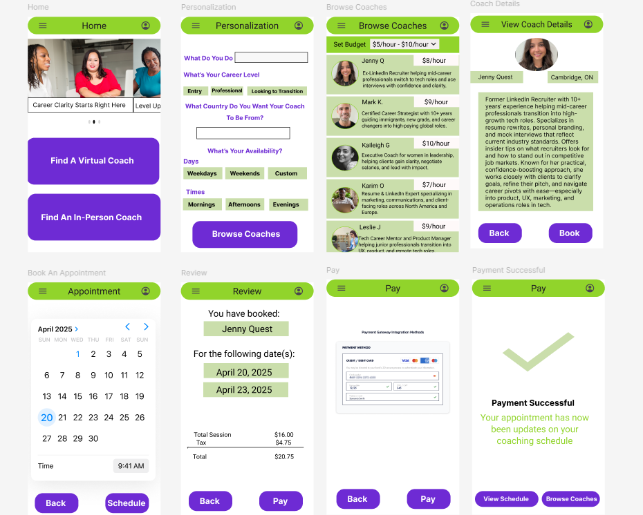
Mockups
The mockups bring the FindACoach app to life by layering visual design, branding elements, and refined UI components onto the validated structure of the lo-fi prototype. This stage focuses on enhancing user engagement through thoughtful use of color, typography, spacing, and iconography—creating a polished, professional interface. Each screen is designed to reflect the app’s core values of clarity, trust, and ease of use, while ensuring consistency across the user journey from homepage to booking confirmation. The mockups provide a realistic preview of the final user experience.
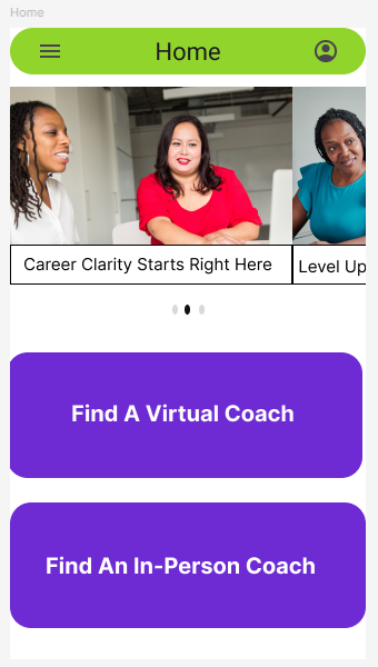
Hi-Fi Prototype
The high-fidelity prototype presents a fully interactive and visually complete version of the FindACoach app, showcasing both refined design and functional flow. It combines the finalized UI elements, brand colors, typography, and real content to simulate the actual user experience. This prototype allows for in-depth usability testing, stakeholder feedback, and clearer visualization of user interactions, from selecting coaching preferences to completing payment. It represents the final stage before development, ensuring the design is both intuitive and aligned with user expectations and business goals.
3
Many coaches don’t clearly state their niche, making it hard for users to assess fit before booking a session.
Mockups | Hi-Fi Prototype
4
Users want easy scheduling, pricing clarity, and session options—features often missing on current coaching platforms.
Paper Wireframe | Digital Wireframe | Lo-Fi Prototype