TARRABIZ
TARRABIZ
Tarrabiz: Designing clear, human-centered content for a mobile-first finance SaaS experience
Introduction
Purpose of the Case Study:
Designing content for a SaaS platform that empowers solo entrepreneurs and small businesses to manage payments, automate operations, and grow smarter, with content that reduces overwhelm and builds user confidence.
My Role:
UX Content Designer
Voice & Tone Strategist
Microcopy & Onboarding Flow Creator
Problem
Small business owners struggle with managing their finances, tools, and customer interactions using disconnected platforms. Financial terms and dashboards are often too technical, causing confusion and drop-offs.
Business Goals:
Simplify complex financial tasks
Improve payment and scheduling flow completion
Build trust through helpful, jargon-free copy
Content Goals:
Create a cohesive voice across flows
Guide users with clear instructions and feedback
Anticipate confusion and provide contextual help
Team
Product Designer | Product Manager | UX Researcher | Compliance/Legal | Engineering
Onboarding Flow Transformation
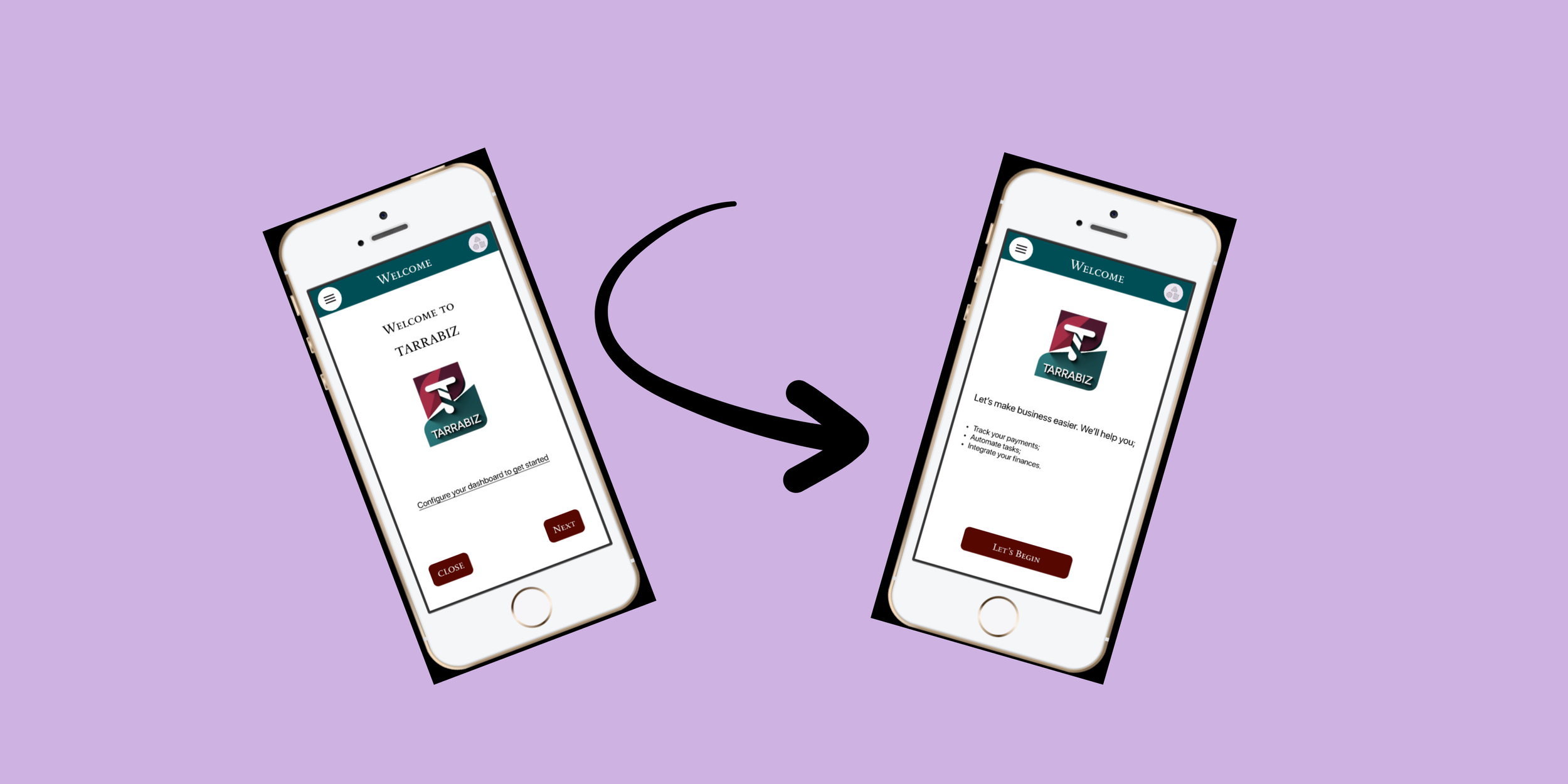
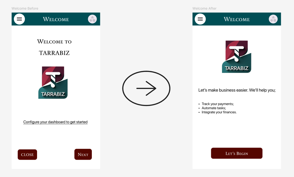
Version 1 (Functional): “Configure your dashboard to get started.”
Problem:
Technically clear, but assumes the user already understands what "configure your dashboard" means.
Version 2 (Value-led): “Set up your dashboard to manage your business in one place.”
What improved:
Communicated the benefit.
What didn't:
Still felt like a task the user needed to complete rather than an invitation to begin.
Final Pick:
“Let’s make business easier. We’ll help you;
Track your payments;
Automate tasks;
Integrate your finances.”
This reduces uncertainty, makes the value proposition front and center, and makes the first step feel less intimidating.
Payment Prompts | Tooltip Microcopy
User Persona (Summarized)
Name: Anita: Business Coach
Pain Points:
Struggles with tracking international payments
Finds dashboards overwhelming
Wants help automating subscriptions and appointments
What content must do:
Use plain language and provide contextual help
Offer encouragement and next steps
Avoid tech jargon or financial complexity
Payment prompt
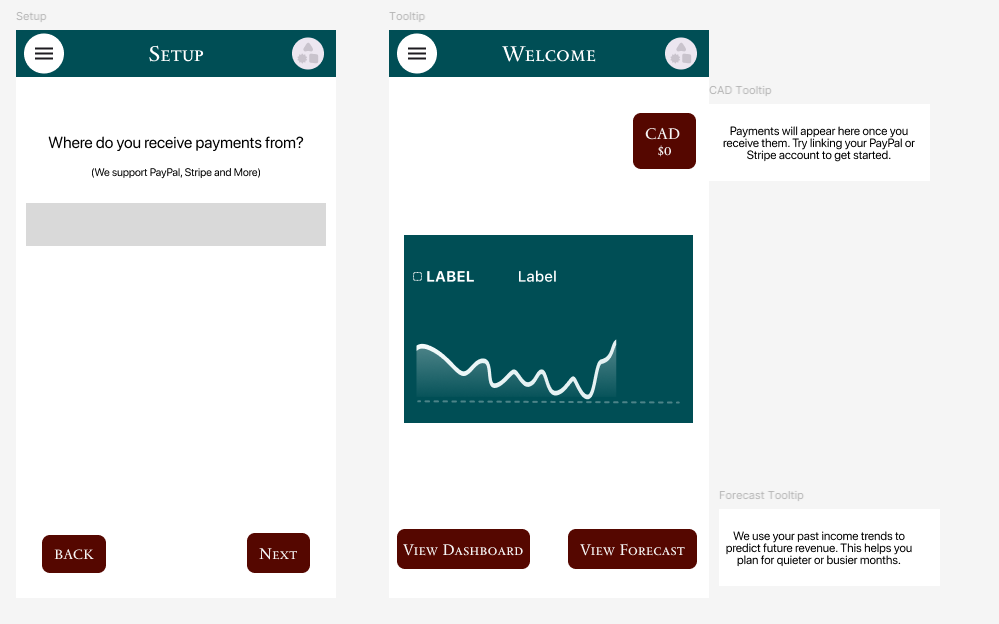
“Where do you receive payments from?”
Tooltip Copy
“We support PayPal, Stripe, and more.”
Design challenge:
Users may hesitate to continue if they don't know whether their payment provider is supported.
Content decision:
I used helper text to answer the likely question before the user had to ask it.
Why this works:
It reduces uncertainty without adding another step to the flow.
Result:
Increased completion of payment setup
Reduced abandonment at payment-provider selection
Fewer support questions about supported providers
Error State Highlights
Scenario
Task:
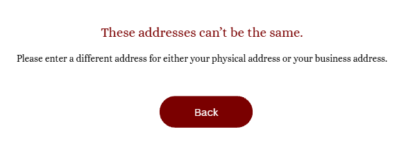
Given a user selects that they have both a physical address and a business address,
When the system detects that the two addresses entered are identical,
Then an error state is triggered, the user is prevented from moving forward, and guidance is shown instructing them to enter different addresses.
Process Breakdown
Initial approach - “Error: Physical and business addresses cannot be the same.”
Iteration - “Your physical and business addresses need to be different.”
Final - “The addresses can’t be the same. Please enter a different address for either your physical address or your business address.”
Why?
The first version was technically accurate but didn't tell the user what to do. I shifted from describing the system rule to explaining the user's next action.
—————————————————————————————————————————————————————
Scenario
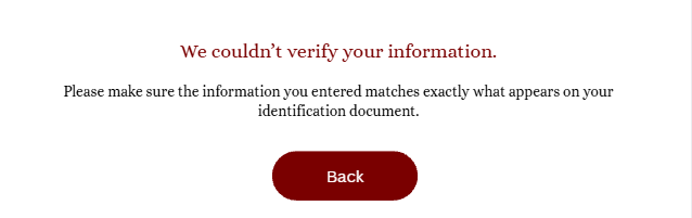
Given a user provides required personal information (such as name or date of birth) and uploads a valid ID document,
When the entered details differ from the information extracted from the ID,
Then the system triggers an error state, highlights the fields that may be incorrect, and prompts the user to review and correct the information before continuing.
—————————————————————————————————————————————————————-
Scenario
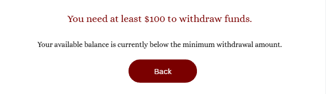
Given a user initiates a withdrawal from their business balance to their linked bank account,
When the withdrawal amount entered is below $100,
Then the system triggers an error state, blocks the transaction, and informs the user of the minimum withdrawal amount required to proceed.
—————————————————————————————————————————————————————-



Final Reflection & Lessons Learned
My biggest takeaway was that financial content needs to do more than explain. It needs to reduce uncertainty at the exact moment a user feels it.
I learned to think about every piece of content as part of a larger interaction: What does the user know? What are they likely to misunderstand? What decision are they trying to make? And what do they need from us to move forward confidently?
My goal as a content designer was simple: to make the experience smooth and easy to understand.